

Susana from SCACD graciously sent the DT a stamp to demonstrate Elaine's technique, and we each used one from the exclusive line of stamps Susana has HERE. AND SCACD is offering up two HUGE and completely fabulous prizes this time so there will be TWO winners and just LOOK at what you can win: Details HERE for set #1 and HERE is set #2!!!


Yes, that's right, one person will win the first set and another will win the second set and how cute are those stamps?? Challenge details are at the bottom of the post, with a prize like this you guys need to take part!!!


Yes, that's right, one person will win the first set and another will win the second set and how cute are those stamps?? Challenge details are at the bottom of the post, with a prize like this you guys need to take part!!!
**************************************************************
Elaine's Tutorial


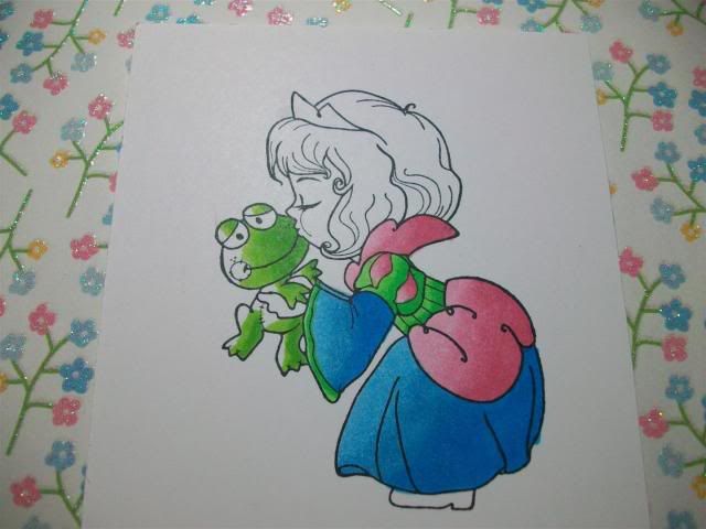
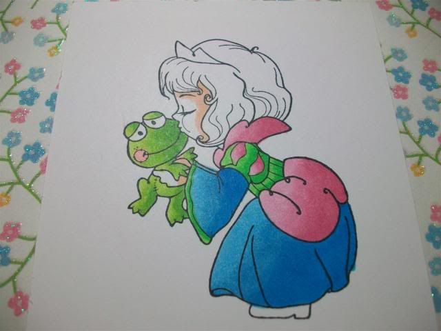
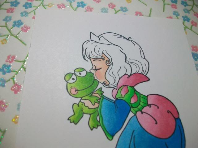
The new Elisabeth Bell for SCACD stamp - Angel of Hope - was a perfect choice for this tutorial. Check out that gorgeous dress! Full details on the finished card can be seen in my personal blog post - Angel of Hope card.
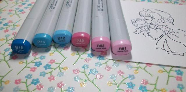
Copic Markers used: YR0000, Y21, Y26, Y28

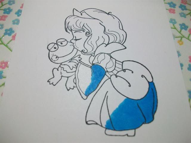
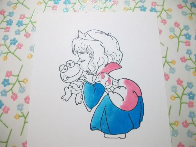
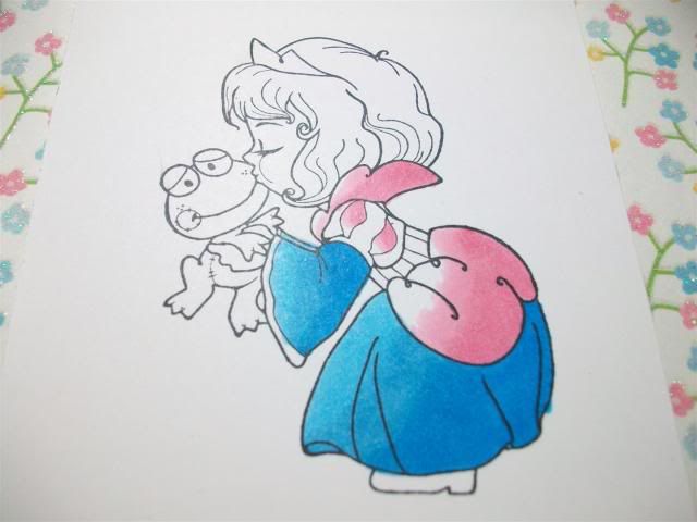
1. Firstly, you will need to decide on the direction of your light source, and where your shadows will be. Pick out these areas using your darkest shade - in this case Y28.

2. Using the next marker down - in this case Y26 - lay down the colour slightly overlapping the shadow areas. I tend to use light strokes, feathering out from the shadow areas. Don't worry too much about blending at this stage, it will look messy but you can deal with that later!

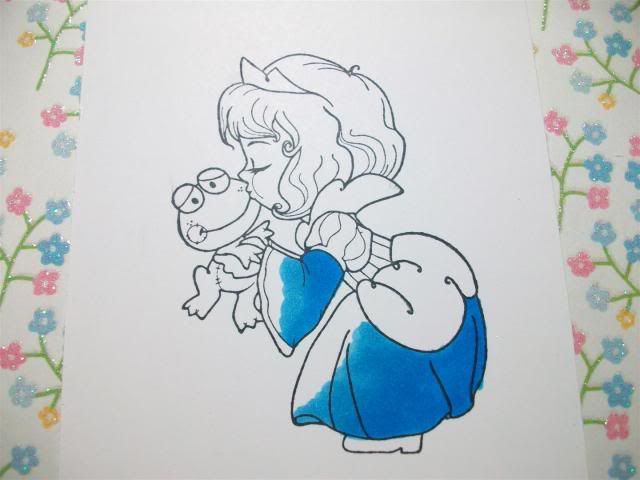
4. Using the next lightest shade - in this case Y21 - lay down colour overlapping the last layer, moving in light strokes towards the area where you want your highlights, leaving the desired highlight area white.

5. Go back over the image again, starting with your darkest shade (Y28) to deepen the shadows, and working back as before with your other shades (Y26, Y21), this time taking a little more time to blend the colours. How long you spend on this depends on the depth of colour and shadow you want to achieve, just be careful not to over-saturate your paper!

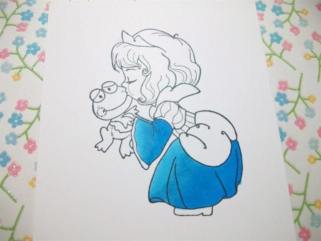
6. Finally, I like to soften the highlight areas and blend the last layer of colour out a little using one of the lightest shades - in this case YR0000 (I find the 0000 markers extremely useful for this). I may also finish off by adding a little more Y28 into some of the shadow areas to add a little extra depth.
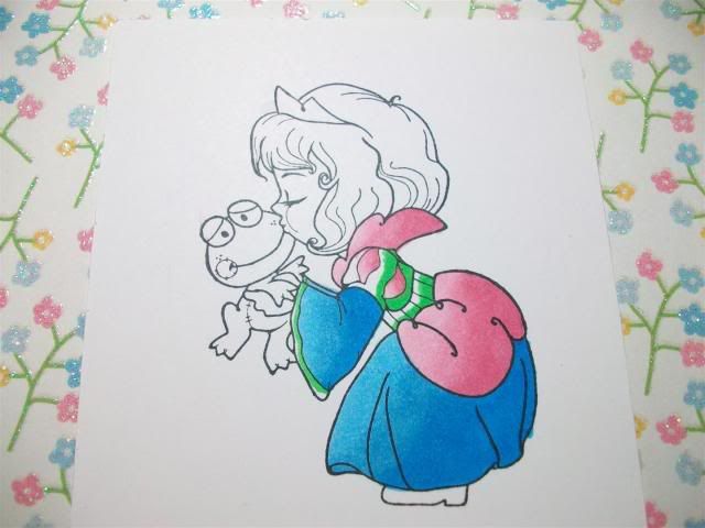
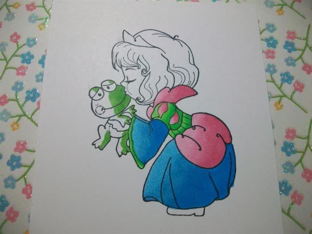
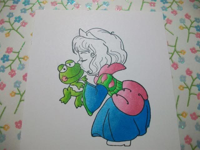
Note on Wings:
Angel of Hope has beautiful wings, so a quick note on those!
I really like E40, E41, E42, E43 for a nice soft natural look to feathers. Here I have used E41 and E43.

1. Pick out shadow areas and areas where you want a little extra colour with your darkest shade - in this case E43.

2. With a lighter shade - in this case E41 - go over the shadow lines and blend outwards using a light feathered touch.
That's it! You may want to blend more and then deepen the shadows by going back in with E43. On the finished example I spent a little more time blending with E41, and then finished off with a touch more E43 in some of the detail areas to add extra depth. Play around and see what works for you! Don't worry about making it perfect - you want a slightly textured, soft and natural look.
**************************************************************
DT Samples
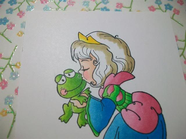
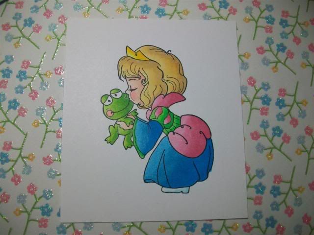
Amy Young
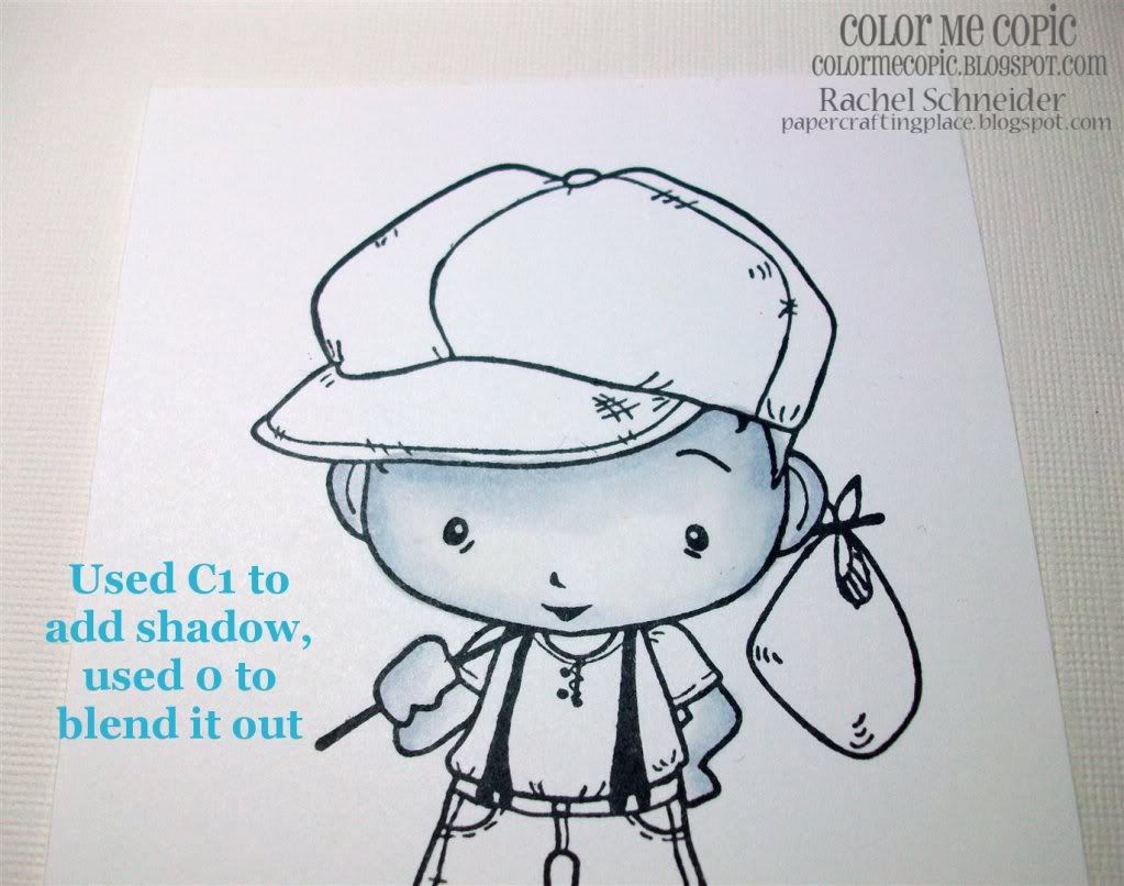
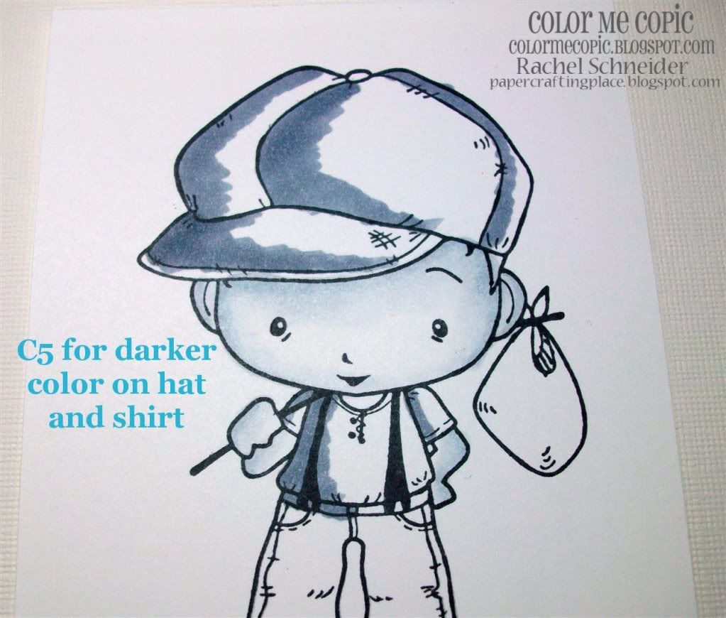
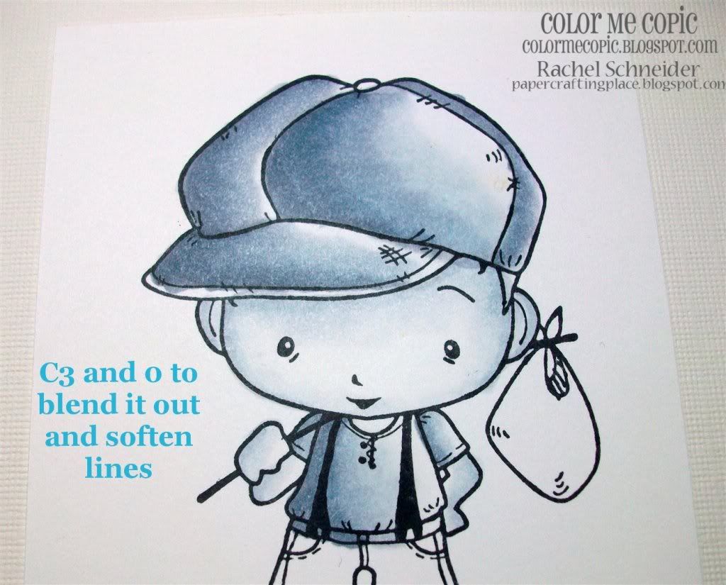
 Rach
Rach
Amy Young


Traci

**************************************************************
Challenge Fine print:
Make a project using Elaine's clothing coloring technique
New creations only (we check)
New creations only (we check)
You can use any stamps you'd like
Link it up here by October 20th
Winner will be chosen by random.org
DT will pick some of our favorite creations to showcase
Thanks for joining us!
~The CMC Team~
~The CMC Team~
.JPG)
.JPG)
.JPG)
.JPG)
.png.jpg)
.JPG)
.JPG)
.JPG)
.JPG)
.JPG)
.JPG)
.JPG)
.JPG)
.JPG)
.JPG)


