
This is the tutorial featured in the February 2010 TGF Newsletter
I thought I'd share how I color some of my stamps, here is a very basic tutorial on shading with a "light source" coming from the side. I say it's pretty basic because we aren't worrying about folds in the clothing and creating dimension and whatnot right now, it's just a straightforward way to learn to start shading.
The paper in the background is what I'm going to use on my card so I am picking my colors to match the paper.
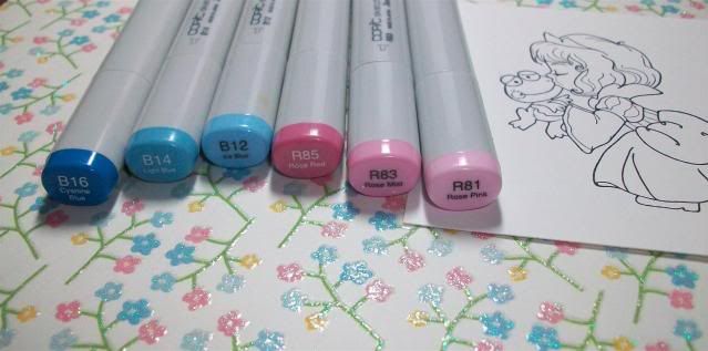
Most of the time I use 3 colors for shading. I'm starting off with B16/14/12 and R85/83/81. First off, I pick a light source, in this case I'm assuming the light is coming right at her face (from the left side of the page), therefore I'm starting with my darkest colors on the back part of her (or the right side of the image). I start with B16, then move to B14 and I blend a lot where the two of them meet so hopefully there is no line.
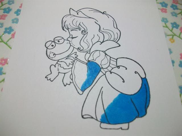
Then I add B12, once again shading where the colors meet to avoid any lines. I also go back and add more of my darker color, in this case B16, if I feel a bit more contrast is needed.
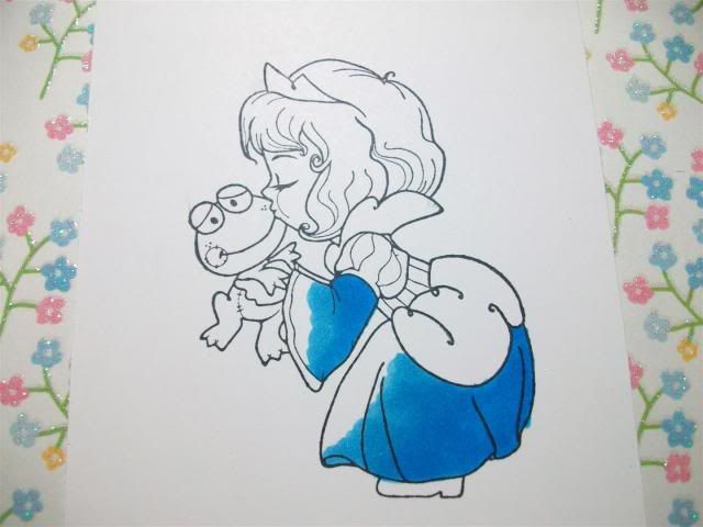
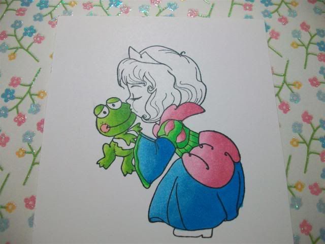
Next I do the same thing with the pinks, I start with R85...
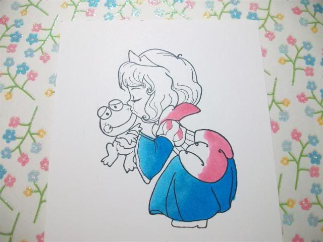
...then R83...
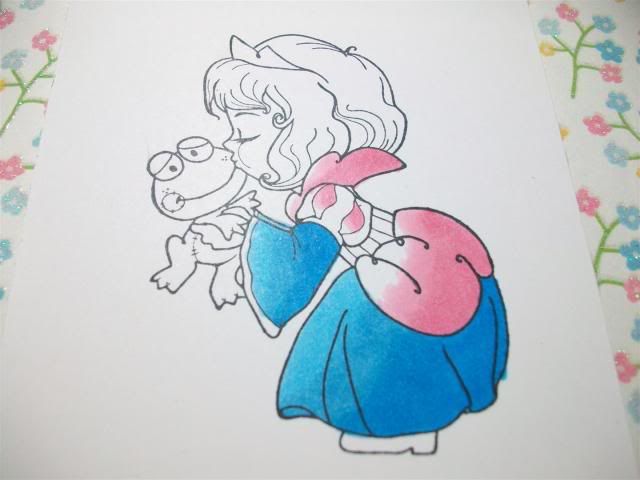
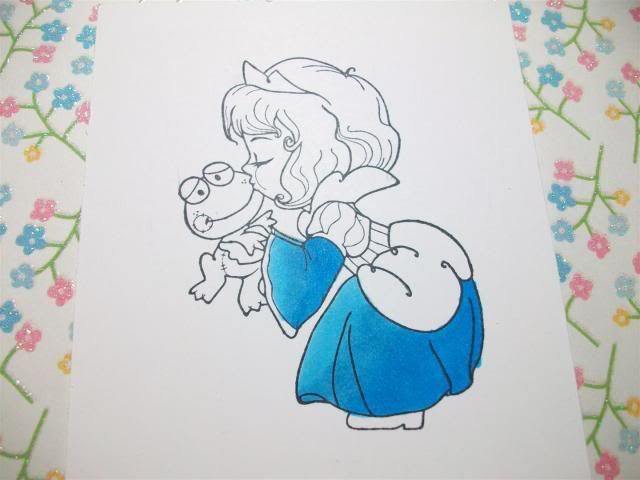
...then R81, I also added more R85 for more shadow. I also added YG09 to her dress at this point.
**TIP** When shading a very small area, go from your darkest (YG09) straight to your lightest (YG06), there isn't enough space to add the middle color.
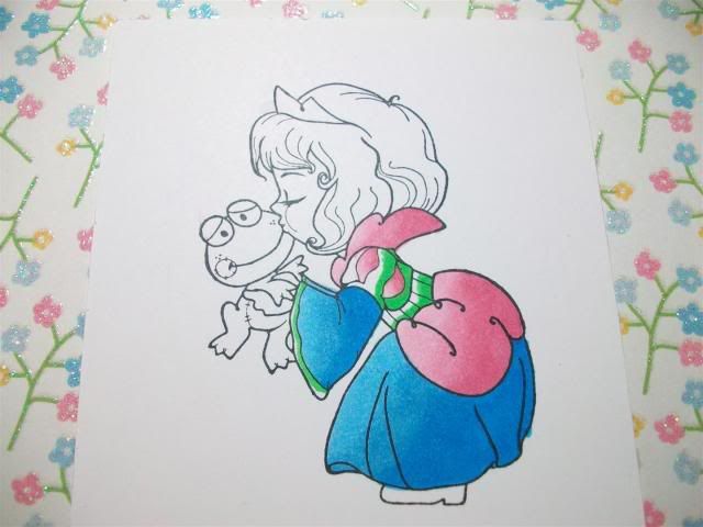
On Mr. Froggy I used YG17...
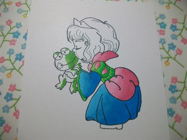
...then YG25...
...then YG03 and R20 (for "blush" on his cheeks).
For her face I do the darkest color (E11) near her hairline and then move to...
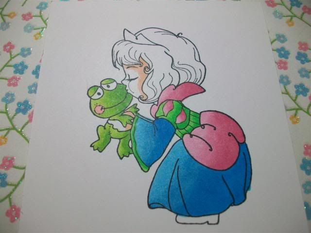
...E00...

...then E000 with R20 for accents on her cheeks and eyelid.
Her crown is Y17,Y08 and Y13. I started shading her hair with Y28.
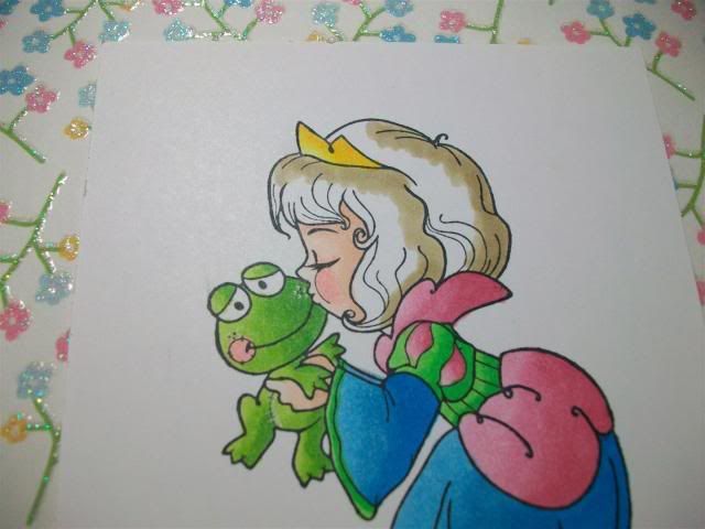
Then I finished her hair off with YR21 and Y21.
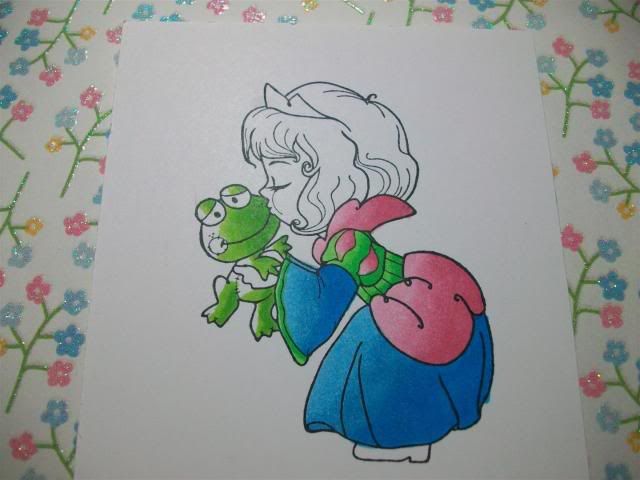
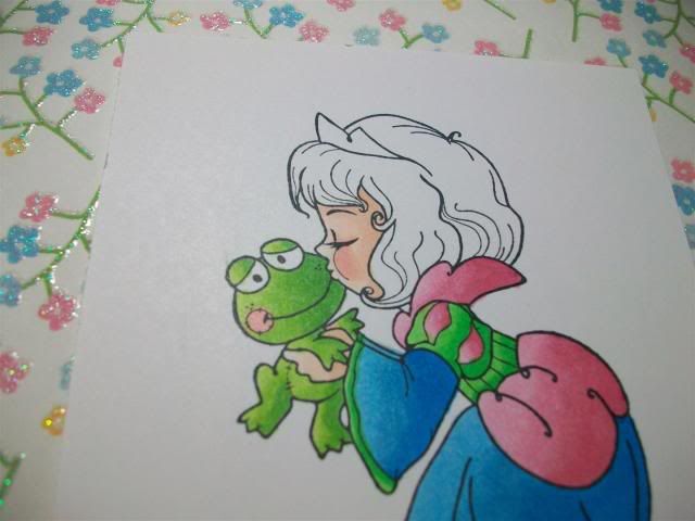
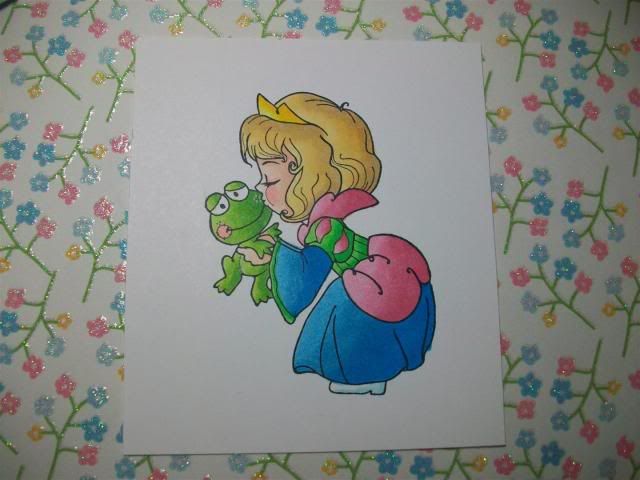
And here she is!
These are just my tips, some people go lightest to darkest, some go over the whole area before shading, etc. There is no wrong way! As a matter of fact, I color a different way every time sometimes, lol!
My "method" on this card:
1. Try to use 3 colors for blending, within 3 digits of one another if possible.
2. Darkest to lightest, blend blend blend where they overlap!
3. When shading very small areas, skip the middle color and just go darkest to lightest.
Image: The Greeting Farm (Twinkle Tots: Princess Ava)


5 comments:
Awesome tutorial, Rach! I love to watch any type of coloring!
thank you for the wonderful tutorial!
Awesome tutorial..Thanks :)
Thanks for sharing your tips. I'll have to give this a try.
I am a new owner of a few copics and found this very useful!! Cheers, Robin
Post a Comment