INSERT ALTERNATIVE TEXT FOR YOUR HEADER IMAGE HERE
Showing posts with label Shading. Show all posts

Friday, October 8, 2010

Coloring Clothes with Copics & a HUGE Challenge!!

We all love those stamps that are really beautiful and have wonderful, elaborate clothing, BUT it can be intimidating for even the most Copic competent person out there to know how to shade correctly! Sooooo... Elaine has put together a wonderful tutorial on how to coloring the folds of clothing using Copics :0)


Susana from SCACD graciously sent the DT a stamp to demonstrate Elaine's technique, and we each used one from the exclusive line of stamps Susana has HERE. AND SCACD is offering up two HUGE and completely fabulous prizes this time so there will be TWO winners and just LOOK at what you can win: Details HERE for set #1 and HERE is set #2!!!


Yes, that's right, one person will win the first set and another will win the second set and how cute are those stamps?? Challenge details are at the bottom of the post, with a prize like this you guys need to take part!!!

**************************************************************
Elaine's Tutorial


The new Elisabeth Bell for SCACD stamp - Angel of Hope - was a perfect choice for this tutorial. Check out that gorgeous dress! Full details on the finished card can be seen in my personal blog post - Angel of Hope card.

Copic Markers used: YR0000, Y21, Y26, Y28
1. Firstly, you will need to decide on the direction of your light source, and where your shadows will be. Pick out these areas using your darkest shade - in this case Y28.


2. Using the next marker down - in this case Y26 - lay down the colour slightly overlapping the shadow areas. I tend to use light strokes, feathering out from the shadow areas. Don't worry too much about blending at this stage, it will look messy but you can deal with that later!

4. Using the next lightest shade - in this case Y21 - lay down colour overlapping the last layer, moving in light strokes towards the area where you want your highlights, leaving the desired highlight area white.

5. Go back over the image again, starting with your darkest shade (Y28) to deepen the shadows, and working back as before with your other shades (Y26, Y21), this time taking a little more time to blend the colours. How long you spend on this depends on the depth of colour and shadow you want to achieve, just be careful not to over-saturate your paper!

6. Finally, I like to soften the highlight areas and blend the last layer of colour out a little using one of the lightest shades - in this case YR0000 (I find the 0000 markers extremely useful for this). I may also finish off by adding a little more Y28 into some of the shadow areas to add a little extra depth.

Note on Wings:

Angel of Hope has beautiful wings, so a quick note on those!

I really like E40, E41, E42, E43 for a nice soft natural look to feathers. Here I have used E41 and E43.

1. Pick out shadow areas and areas where you want a little extra colour with your darkest shade - in this case E43.


2. With a lighter shade - in this case E41 - go over the shadow lines and blend outwards using a light feathered touch.

That's it! You may want to blend more and then deepen the shadows by going back in with E43. On the finished example I spent a little more time blending with E41, and then finished off with a touch more E43 in some of the detail areas to add extra depth. Play around and see what works for you! Don't worry about making it perfect - you want a slightly textured, soft and natural look.

**************************************************************
DT Samples

Amy Young
Rach

Traci


**************************************************************

Challenge Fine print:
Make a project using Elaine's clothing coloring technique
New creations only (we check)
You can use any stamps you'd like
Link it up here by October 20th
Winner will be chosen by random.org
DT will pick some of our favorite creations to showcase

Thanks for joining us!
~The CMC Team~

Friday, August 6, 2010

Changing Colors Tutorial by Rachel


So I have this beautiful image and these beautiful papers that I want to use with it. The problem? I don't have the correct color tones to match the paper! So this is a quick tutorial on what I do when I need to "dirty" something up/tone it down, whatever you want to call it ;0)

I color the image first with colors that match the papers as close as I can. 


The colors on the paper are pretty, but a bit muted so I am going to add a marker with a grey tone in it, in this case YG93.  You do NOT have to use this specific marker, most markers with grey tones will work, this is just the one I personally prefer.


 I don't want to touch the pink or the olive green colors because they are fine as they are, but I do want to tone down the blues and oranges and the brighter green.  I use my YG93 to start in the darker areas and do a single light layer up to the lighter areas.  On my orange I didn't want to mess with the light orange area much so I stayed away from it, but on the blue I really want to change the whole tone so I colored over the whole area.

There isn't a huge, dramatic difference, but if you look at the orange, blue and bright green they are toned down a bit and match the paper a bit better (click on pic for larger one).


I also did the same thing on the leaves of the tree on this card; the turquiose I had was just not the right shade so I swiped it with my YG93 to tone down the color a bit:


Images by Pink Cat Studio

Friday, July 2, 2010

Basic Shading Tutorial - by Rachel

This is the tutorial featured in the February 2010 TGF Newsletter

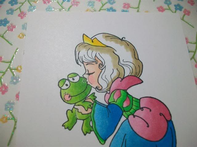
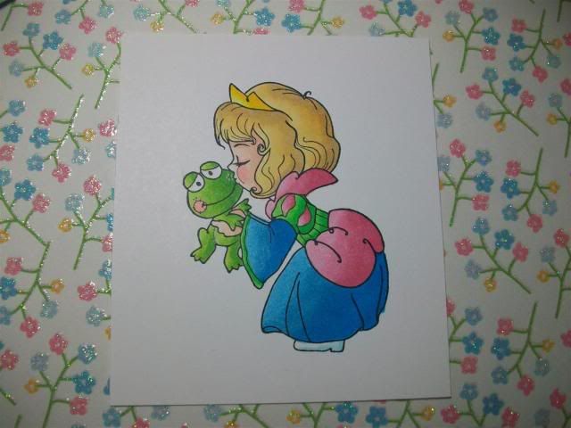
I thought I'd share how I color some of my stamps, here is a very basic tutorial on shading with a "light source" coming from the side.  I say it's pretty basic because we aren't worrying about folds in the clothing and creating dimension and whatnot right now, it's just a straightforward way to learn to start shading.

The paper in the background is what I'm going to use on my card so I am picking my colors to match the paper.


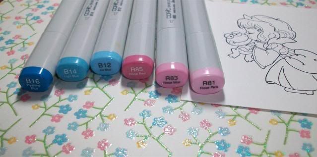
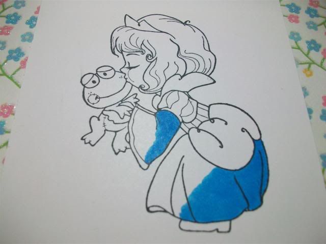
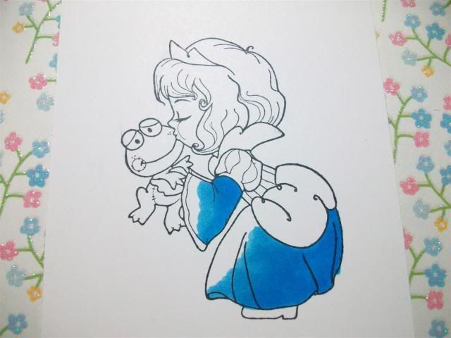
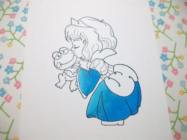
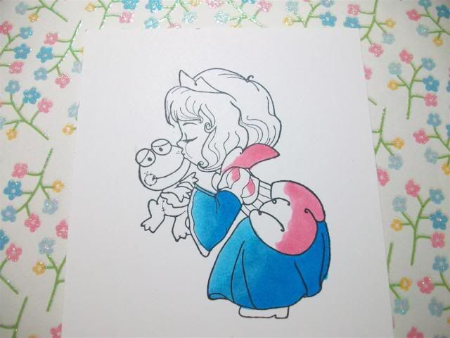
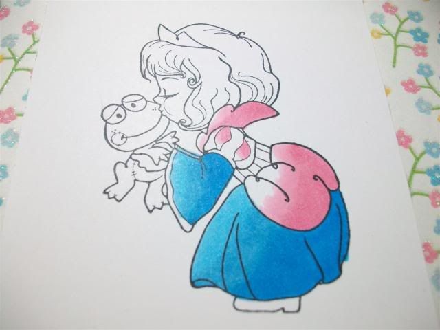
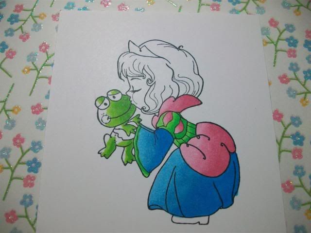
Most of the time I use 3 colors for shading.  I'm starting off with B16/14/12 and R85/83/81.  First off, I pick a light source, in this case I'm assuming the light is coming right at her face (from the left side of the page), therefore I'm starting with my darkest colors on the back part of her (or the right side of the image).  I start with B16, then move to B14 and I blend a lot where the two of them meet so hopefully there is no line.


 Then I add B12, once again shading where the colors meet to avoid any lines.  I also go back and add more of my darker color, in this case B16, if I feel a bit more contrast is needed.


Next I do the same thing with the pinks, I start with R85... 


...then R83... 


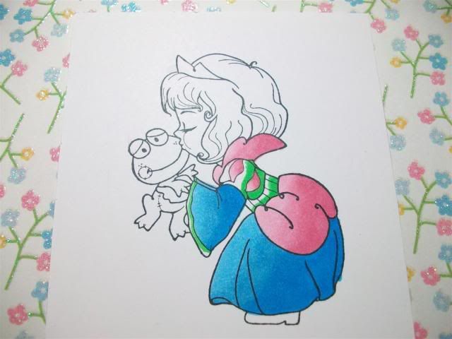
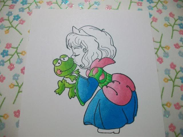
...then R81, I also added more R85 for more shadow.  I also added YG09 to her dress at this point. 
**TIP** When shading a very small area, go from your darkest (YG09) straight to your lightest (YG06), there isn't enough space to add the middle color.


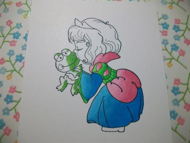
On Mr. Froggy I used YG17...


...then YG25...


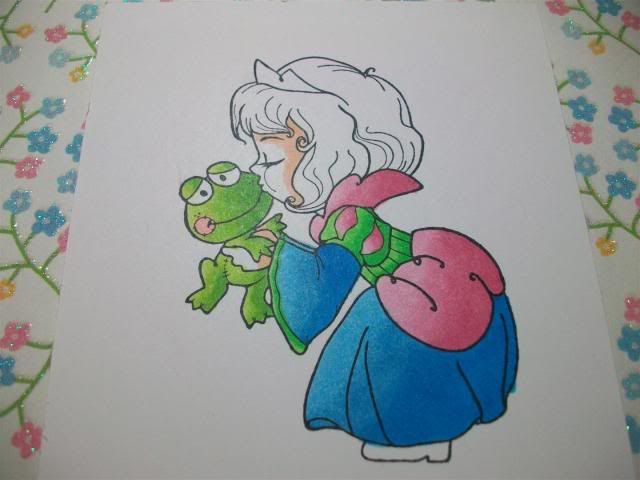
...then YG03 and R20 (for "blush" on his cheeks).


For her face I do the darkest color (E11) near her hairline and then move to...


...E00...


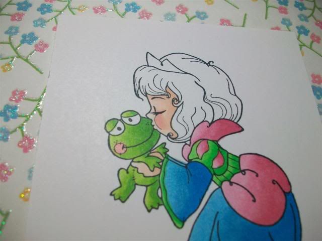
...then E000 with R20 for accents on her cheeks and eyelid.


Her crown is Y17,Y08 and Y13.  I started shading her hair with Y28.


Then I finished her hair off with YR21 and Y21.
And here she is!


These are just my tips, some people go lightest to darkest, some go over the whole area before shading, etc.  There is no wrong way!  As a matter of fact, I color a different way every time sometimes, lol!

My "method" on this card:
1.  Try to use 3 colors for blending, within 3 digits of one another if possible.
2.  Darkest to lightest, blend blend blend where they overlap!
3.  When shading very small areas, skip the middle color and just go darkest to lightest.


Image: The Greeting Farm (Twinkle Tots: Princess Ava)